Global bank. Internal risk tools.
Senior UX/UI Designer at a global bank via Luxoft Poland. Worked across two surfaces over 18 months: updates to the public marketing website and its design system, and a new internal risk-analytics dashboard for a decision-making team. Also led internal accessibility advocacy across the program.
00

problem
The client is a global bank with operations across Asia, Europe, the Middle East, and Africa, which means everything it builds has to work across regions, languages, regulations, and internal teams that all move at different speeds. I joined through Luxoft Poland as Senior UX/UI Designer, embedded in a five-designer team, with full-access credentials and the same day-to-day as an internal employee. Over 18 months I worked on two very different problems inside the same organization: One, the public marketing website: a multi-domain, multi-language surface where content teams in different regions were stuck waiting on developers for every update, design consistency was drifting across language variants, and accessibility was uneven. Two, an internal risk-analytics dashboard for a decision-making team: a new product that had to take enterprise-grade complexity and make it fast, legible, and trustworthy for the people actually making calls on it. Two surfaces, one bank, very different constraints.
solution
On the marketing website, I audited the non-English language domains for design-system drift, accessibility issues, and content gaps, then shipped the updates that brought them back in line. I extended the design system with new components the content teams needed, added the assets and templates that let non-technical editors (marketing, legal, compliance) publish without developer help, and worked through the WordPress limitations that got in the way of a modern multi-regional site. Smaller typography, spacing, and hierarchy adjustments improved readability and search visibility across languages. On the internal risk-analytics dashboard, I designed the product from the ground up as part of a larger enterprise modernization effort. The users were decision-makers operating with dense data and complex workflows. The design work centered on information architecture for complex tables, data visualization that stayed honest under dense load, and interaction patterns that respected the speed these users actually work at. The dashboard is live and in active internal use. Alongside the product work, I became the internal advocate for accessibility across the program. I ran an internal conference on why accessibility matters and what WCAG compliance actually requires, audited the public sites on accessibility, and pushed the team to treat it as non-negotiable rather than a late-stage checkbox.
Joining a five-designer team inside a global bank
I joined the bank through Luxoft Poland in June 2023 as Senior UX/UI Designer. I was embedded in a five-designer team with full internal access, working alongside the bank's product and engineering teams the same way an internal employee would, and managing dev handoff with engineers based in India. Eighteen months, two major surfaces, one bank with presence across Asia, Europe, the Middle East, and Africa.
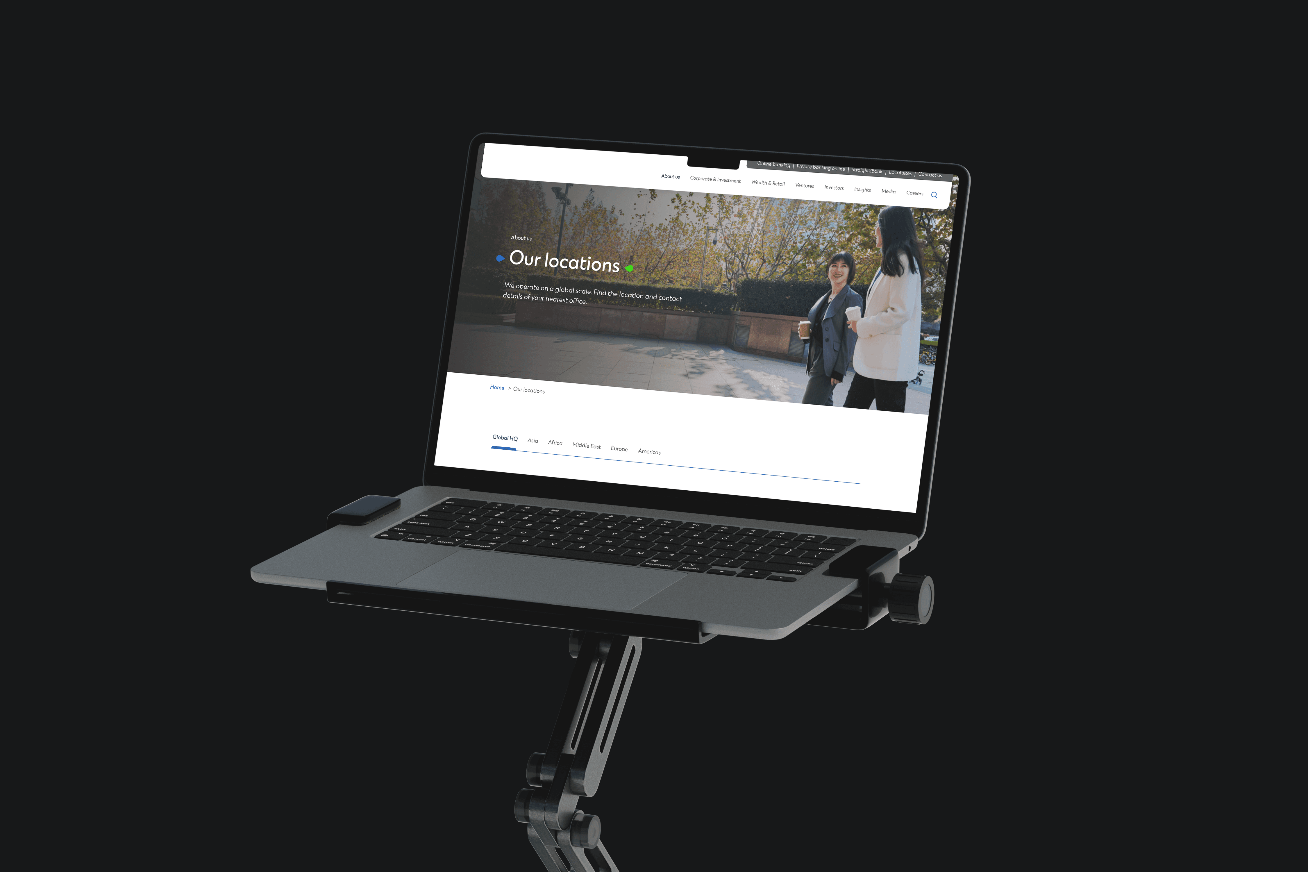
Auditing the public site across languages
The bank operates public websites across multiple countries and languages, each on a different domain, each run by a different regional team. By 2023, the language variants had drifted. The design system had been updated, but the regional sites hadn't all caught up. Spacing, typography, components, and accessibility patterns were inconsistent across markets.
I ran an audit across the non-English domains and shipped the updates that brought them back in line with the current design system. This meant more than a visual pass. It meant understanding how each language actually behaves on screen (character width, line height, directionality, punctuation rules) and making the components flexible enough to hold up across all of them.
Unblocking the content teams
The second half of the marketing work was governance. Regional content teams (marketing, legal, compliance) had to be able to publish campaigns and updates without waiting on developers. WordPress was the CMS. WordPress is not the most flexible tool for a modern multi-regional corporate site, so the work was about maneuvering within its constraints: building a component library, contributor templates, and guidelines that gave non-technical editors real autonomy without letting the visual consistency slip.
I also added the missing components and graphic assets the content teams needed to run campaigns end-to-end. When you give non-designers the right kit, they stop asking for design review on every page. The point of a design system inside an organization this size isn't documentation, it's unblocking people.
Designing a risk-analytics dashboard
The second half of my time at the bank was a different product entirely: an internal risk-analytics dashboard for a decision-making team, designed as part of a larger tech transformation initiative inside the bank.
This is the work I can talk about least specifically because of the nature of the product. What I can say is that the users were decision-makers handling dense, complex data under real pressure, and the design challenge was to take workflows that had matured inside legacy tools and move them into a modern dashboard that kept the power of the old tools while fixing what they couldn't do.
I designed the information architecture for complex tables, the data visualization patterns that surfaced the right signal without misleading the user, and the interaction model for tasks that these users run dozens of times a day. The product is live and in use.
Becoming the accessibility advocate
Accessibility wasn't the reason I was hired. It became the thing I pushed hardest for anyway.
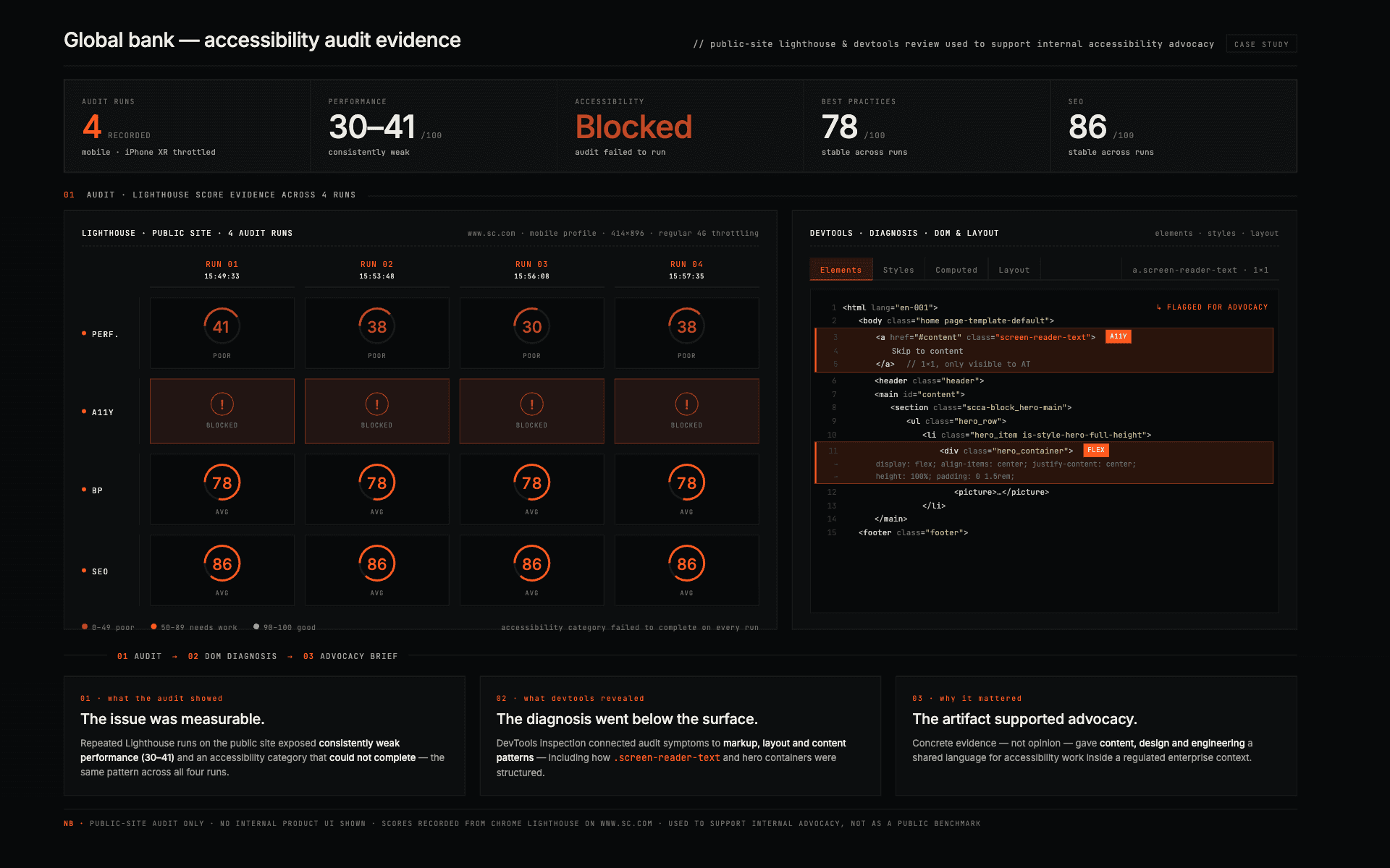
I audited the public websites on accessibility, documented the gaps (contrast, focus order, heading structure, keyboard navigation), and shipped fixes against WCAG targets. I also ran an internal conference on accessibility across the program, making the case to product, engineering, and content teams that accessibility is not a late-stage checklist. It's a design decision that has to live in the components, the content templates, and the review process from day one.
Running the conference internally meant building a case that landed with non-designers: why screen readers matter, what happens when focus order is broken, how language and typography choices compound accessibility decisions across markets. It pushed the team's floor up on every project that followed.
Working across geographies and disciplines
A design team inside a bank this large isn't just designers. On any given week I was working with the bank's product and business teams across multiple regions, engineering teams based in India, Luxoft colleagues in Poland, and regional content teams across the bank's markets. Handoff between time zones, between languages, between design maturity levels. A lot of the work was navigating that, not drawing it.
By the time I wrapped in December 2024, the public site updates were live, the risk-analytics dashboard was in active internal use, and the team was continuing the broader tech transformation (new design systems, migration from legacy internal tools to modern ones) that the program was built around.
year
2023–2024
timeframe
18 months
tools
Figma · WordPress
shipped in
production · internal to the bank (NDA)
category
UI/UX · Enterprise · Accessibility
01

02

see also
0D0F11