Expedia × Uber. Live travel integration.
A live Expedia × Uber integration that lets travelers book a ride inside the Expedia mobile app. Designed at Expedia (via Infogain) on a two-designer team during the US launch.
00

problem
Booking travel shouldn't feel like juggling apps. Expedia users were booking flights and hotels in one place, but the moment they needed ground transportation they had to leave, open Uber or Lyft, book a ride, then come back (or not). Every handoff was a chance to lose the booking. Every lost booking was a conversion hit. Expedia partnered with Uber to close the gap: book a ride from inside the Expedia app, without losing the trip context, without building a new ride-hailing network from scratch. I joined as Product Designer through Infogain, working full-time inside Expedia's design organization. By the time I came on, the executive and legal negotiations were done. The stakeholders had agreed on the partnership. What they didn't have was the design.
solution
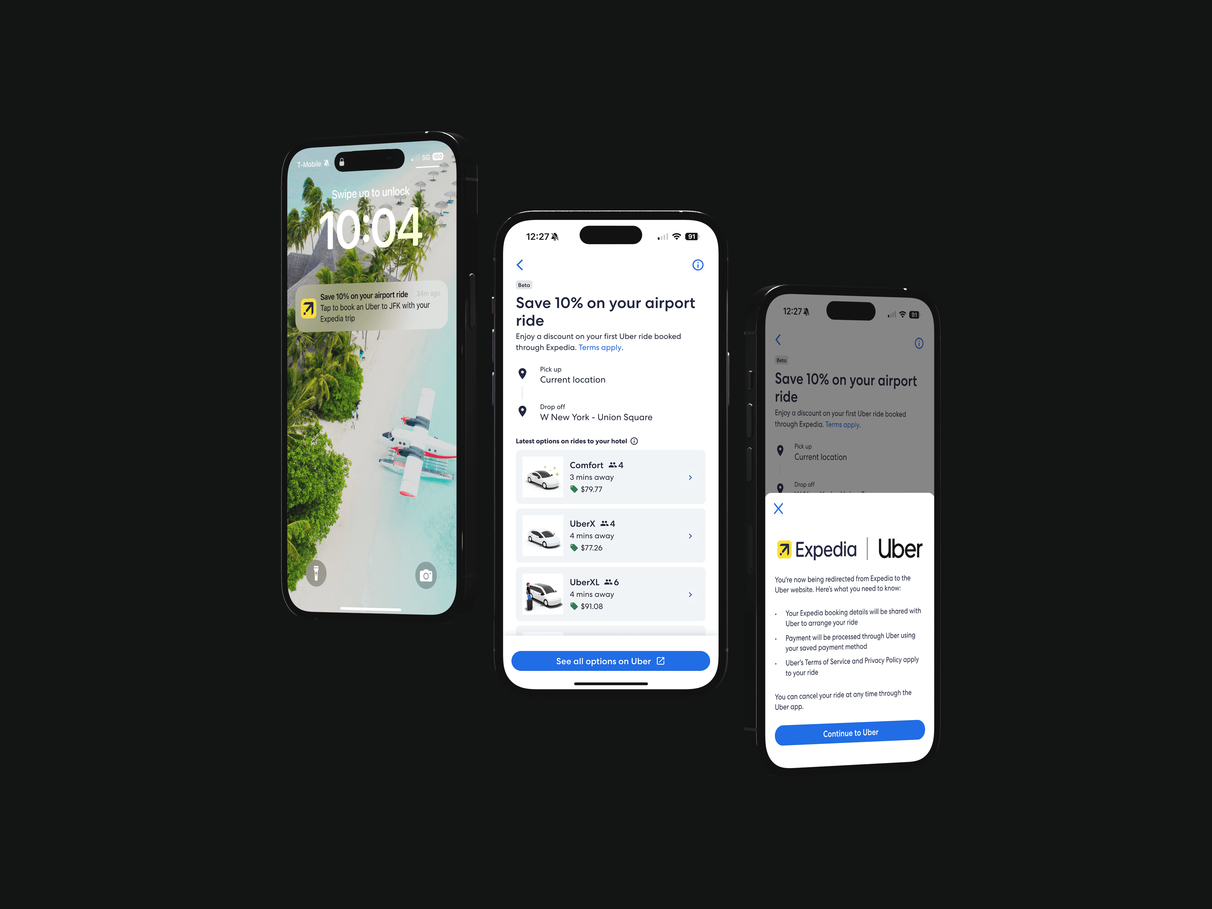
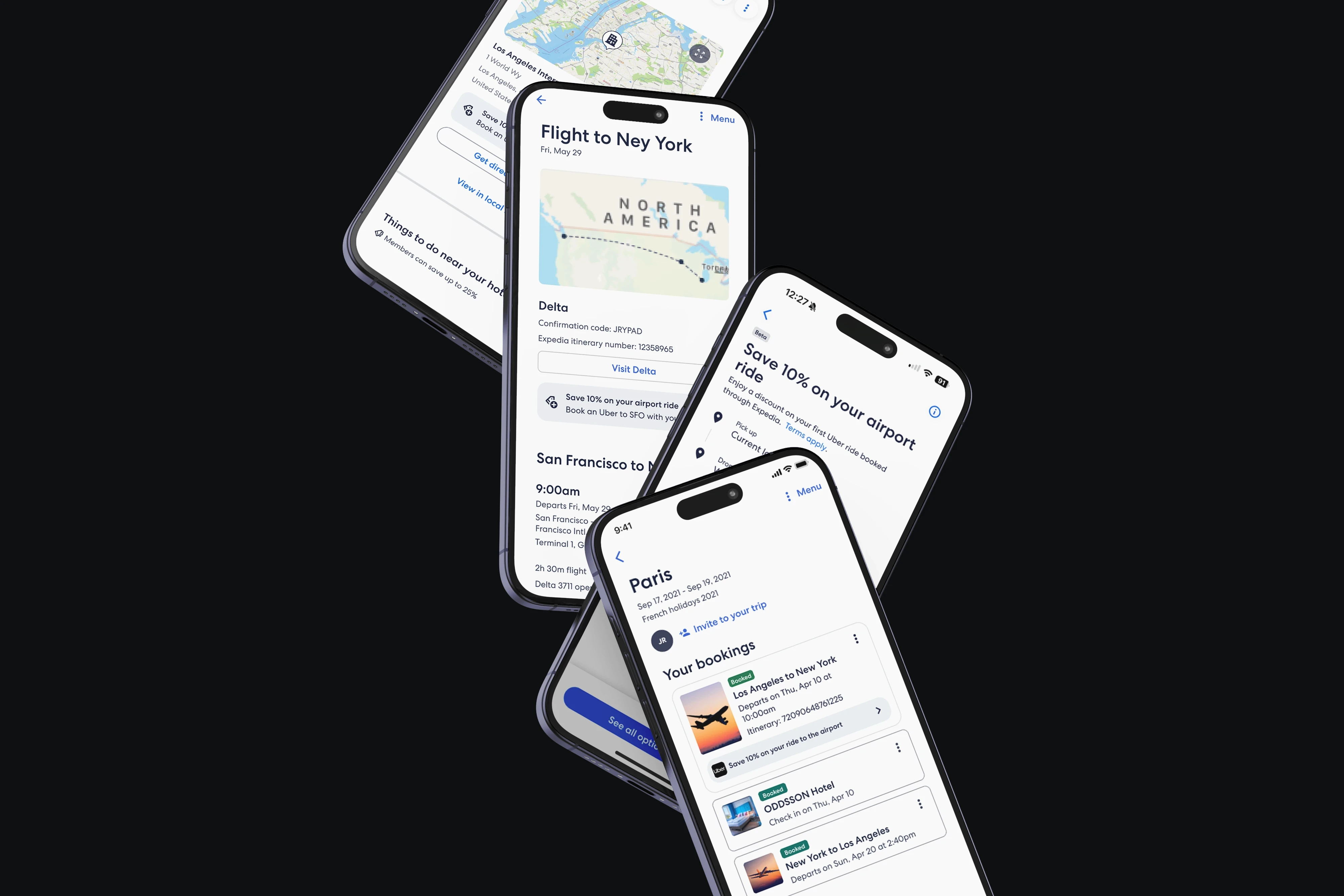
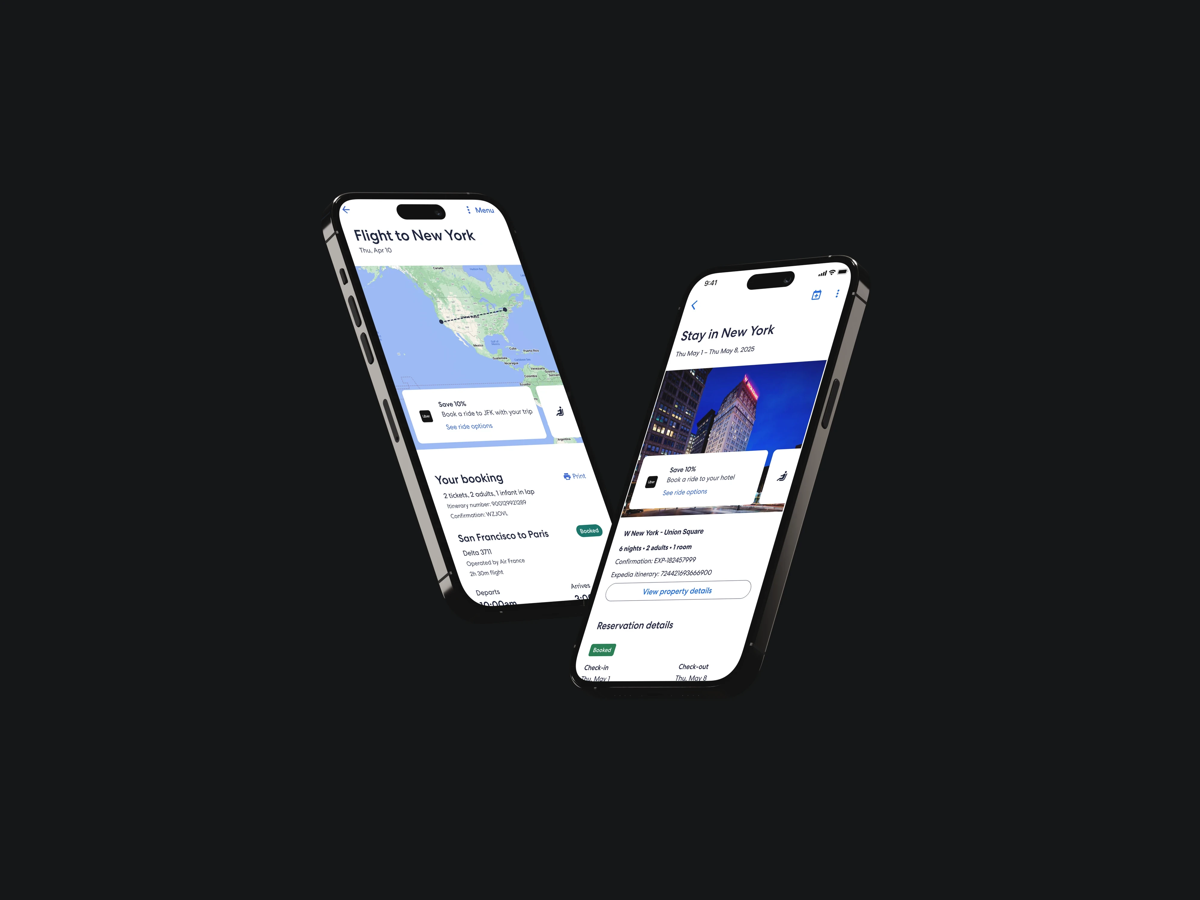
A ride-booking experience that lives inside Expedia but hands off to Uber at the moment that matters. Users see Uber ride options in several places across the Expedia app (after a flight booking, inside a hotel page, inside the trip view) and book the ride from Expedia's surface. Uber handles the ride itself. Three hard problems shaped the design: Two brands, one flow. Uber is minimalist, black, corporate. Expedia is colorful, approachable, travel-excited. Neither company was going to water down its identity, so the solution had to read as Expedia at the entry point and Uber at the transaction point, with a handoff that felt deliberate rather than jarring. Containment vs. redirection. Should the entire booking stay inside Expedia, or should users be redirected to Uber at some point? The business and legal teams made the call: users complete the ride booking in the Uber app, so Uber retains full legal and financial responsibility for the ride. Our job was to design that handoff so it didn't feel like getting dumped out of one app into another. Edge cases that live at the seam. Who owns the payment? What happens when a card is declined mid-booking? What about location permissions users haven't granted to Expedia? Every question was a design decision wrapped around a legal and technical constraint agreed between two public companies. The integration shipped in the US in 2025 and is currently live inside the Expedia mobile app.
Joining after the deal, before the design
When I joined Expedia through Infogain in December 2024, the Expedia × Uber partnership had been negotiated at the executive level. The strategic questions were settled. The design was not. I came on as one of two designers embedded inside Expedia's product design organization, working in their Figma, their design system, and their sprint cadence, to turn an agreed-on partnership into a shipped product.
Designing across two design systems
Uber and Expedia don't look or feel the same. Uber is monochrome, minimal, transactional. Expedia is bright, image-forward, planning-oriented. The brief was explicit: neither system could absorb the other. So we designed the flow as a handoff rather than a merger. Expedia owned the discovery and entry points (where you see the Uber option in the first place), and Uber owned the booking itself (price, vehicle, driver, payment). The seam between them had to be deliberate enough to read as a handoff and clean enough not to feel like a bug.
This meant tight coordination with both design teams. Expedia's design system dictated the entry experience. Uber's constrained what the handoff looked like on their side. Getting both sets of patterns to play together required reading two design systems carefully and finding the narrow space where the transition felt native to both.
The containment decision
The single most important design decision on the project was not a visual one. It was architectural: where does the booking live?
Option A: keep everything inside Expedia. Users never leave. Expedia processes the payment. Cleanest UX, heaviest legal and technical lift.
Option B: redirect to the Uber app at the booking moment. Users hand off. Uber processes the payment. Cleaner legal model, riskier UX because every handoff is a chance to lose the user.
After weighing the legal and business implications, the business teams chose Option B. Uber needed to retain full legal responsibility for each ride, and the cleanest way to guarantee that was to have the user complete the booking in the Uber app itself. Our job shifted from "design the ride booking inside Expedia" to "design the handoff so it doesn't feel like getting dumped out of the app."
We solved it by making the Uber option read like a native Expedia feature up to the moment of handoff, then making the handoff itself feel intentional (loading state, clear transition, a trip context that carries over). Users get the best of both worlds: Expedia's planning context, Uber's booking infrastructure.
User testing at the seams
We ran testing sessions focused specifically on the transition moments. Not "does the button work," but "how does it feel to leave Expedia to finish your ride booking, and does it feel like the same trip you were just planning?" The seams are where an integration like this fails. A user who tapped an Uber card inside Expedia and then landed on what looked like a completely unrelated Uber booking would not trust it. The transitions had to carry context (pickup from this hotel, for this flight) so the user could see their trip following them across apps.
Testing shaped the handoff copy, the loading state, and the set of trip details that pre-fill in the Uber app so the user doesn't retype anything.
The edge cases that decided the scope
A lot of the work on a project like this is negotiating scope with reality. What happens if a user's card is declined inside the Uber app after they started in Expedia? What happens if Expedia doesn't have location permission but Uber does? What happens if the Uber app isn't installed? Each of these questions had a design answer, a legal answer, and a technical answer, and the three didn't always agree. A big part of the work was surfacing these questions early, running them past both legal teams, and landing on answers both companies could ship.
Shipping and the US launch
The integration shipped in the US in 2025. It's live in the Expedia mobile app: Uber ride options surface inside the app after a flight booking, inside hotel pages, and inside the trip view. Travelers booking through Expedia get a promotional discount on their next Uber rides, and the whole flow runs on the handoff architecture we designed. Post-launch research was handled by another team, but early signal was what we'd expected: people liked not having to leave the app to get the next piece of their trip sorted.
The feature is public and documented by Uber: Book an Uber ride through the Expedia Integration feature.
year
2024–2025
timeframe
Dec 2024 – May 2025
tools
Figma
shipped in
production · public launch on Uber help center
category
UI/UX · Partnerships
01

see also
0D0F11