iMakeable
Lawyers' dashboard
Utilizing AI innovation to enhance the efficiency of corporate lawyers' work
2022
In 2022, I embarked on an exciting journey with a forward-thinking startup in the legal tech space. As the sole UX/UI designer in a lean team of five, I had the opportunity to shape how corporate lawyers would interact with AI-powered document processing.
SERVICES
Responsive UI/UX Design, Visual Design, Interaction Design, User Research, Design System Development, Cross-platform Implementation

Project Overview
The challenge was clear but complex: create a dashboard that would make AI accessible and useful for corporate lawyers. We weren't just building another legal tool – we were crafting an experience that needed to feel intuitive for both tech-savvy junior lawyers and experienced senior partners who might be more resistant to technological change.
Our success metrics were impressive: a 25% reduction in document processing time and a 75% increase in user satisfaction. But these numbers only tell part of the story.
Approach
I dove deep into the world of corporate law, conducting one-on-one interviews with 15 lawyers across different experience levels, shadow sessions to understand their daily workflow, analysis of existing tools and pain points, and competitive research in the legal tech space.
Process
My approach combined rigorous user-centered design principles with practical implementation. Starting with a thorough discovery phase, I conducted stakeholder interviews, mapped user journeys, identified pain points, and prioritized features based on user needs. Moving into design development, I created low-fidelity wireframes, built interactive prototypes, ran user testing sessions, and made iterative improvements based on feedback. The visual design phase focused on creating a clean, professional interface while adhering to Material Design principles and Apple's Human Interface Guidelines to ensure consistent branding elements across all platforms.
I believed that for this tool to succeed, it needed to feel both professional and approachable. Drawing from Material Design and Apple's Human Interface Guidelines helped create a familiar feel, while careful attention to information hierarchy ensured users could focus on what matters most.
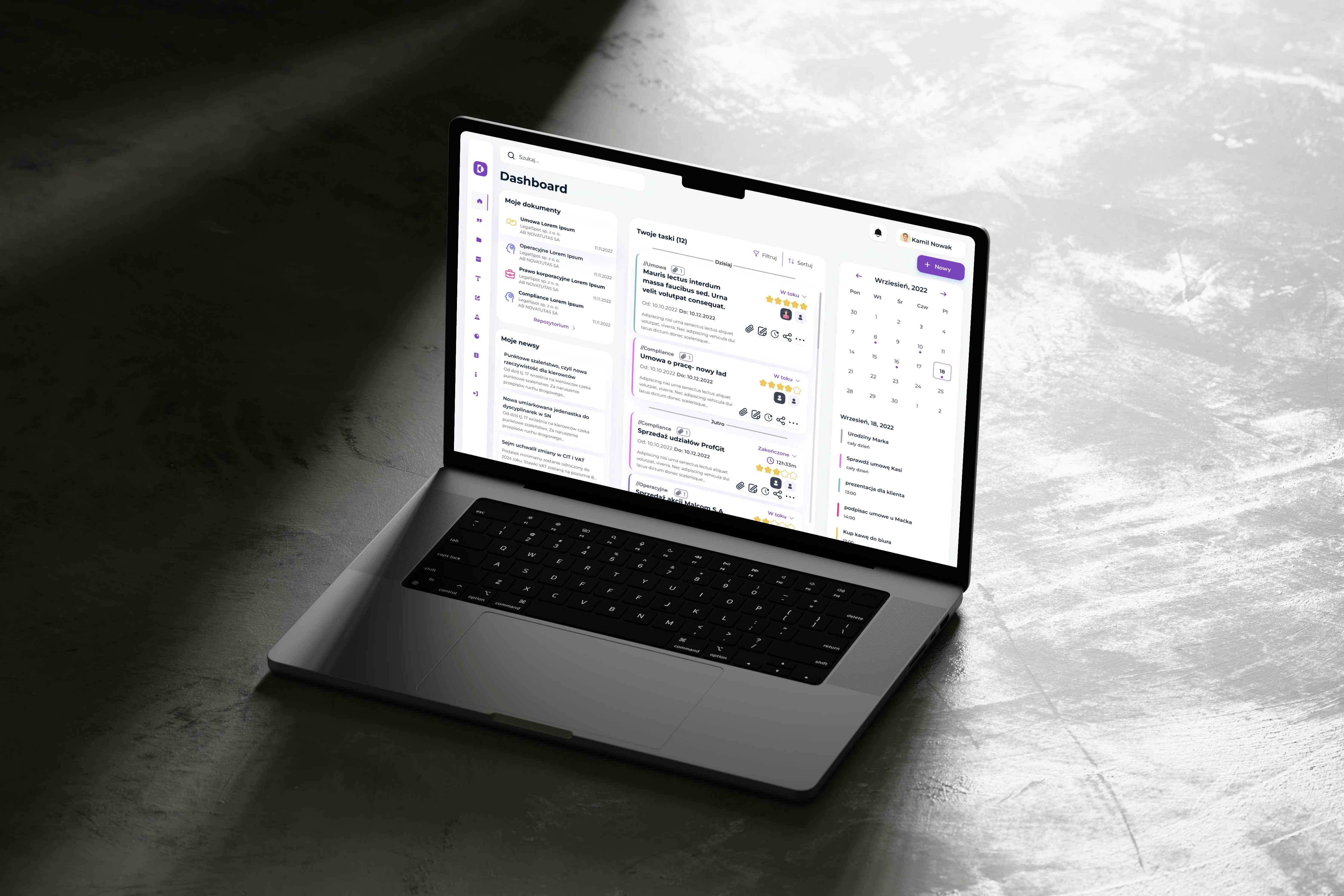
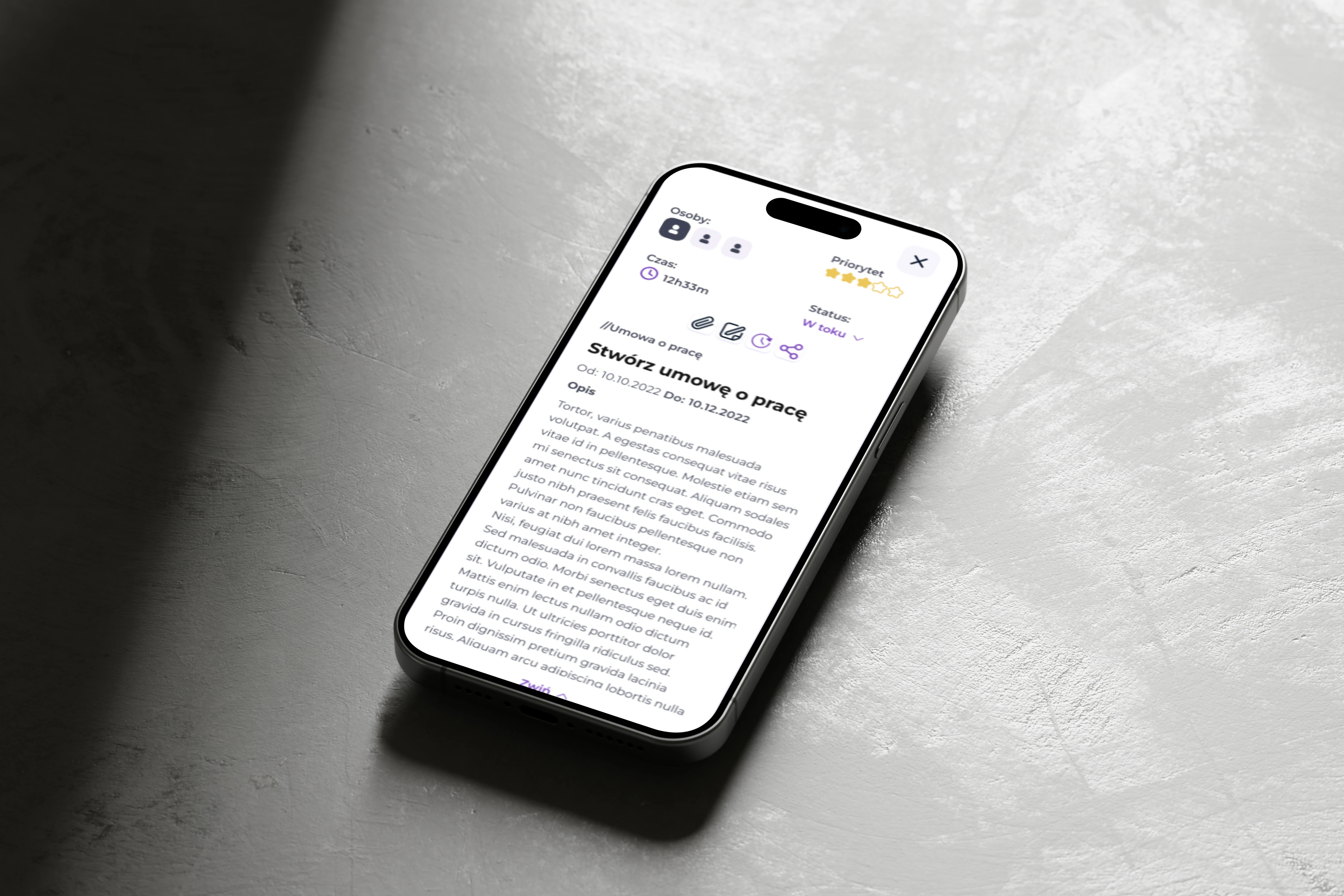
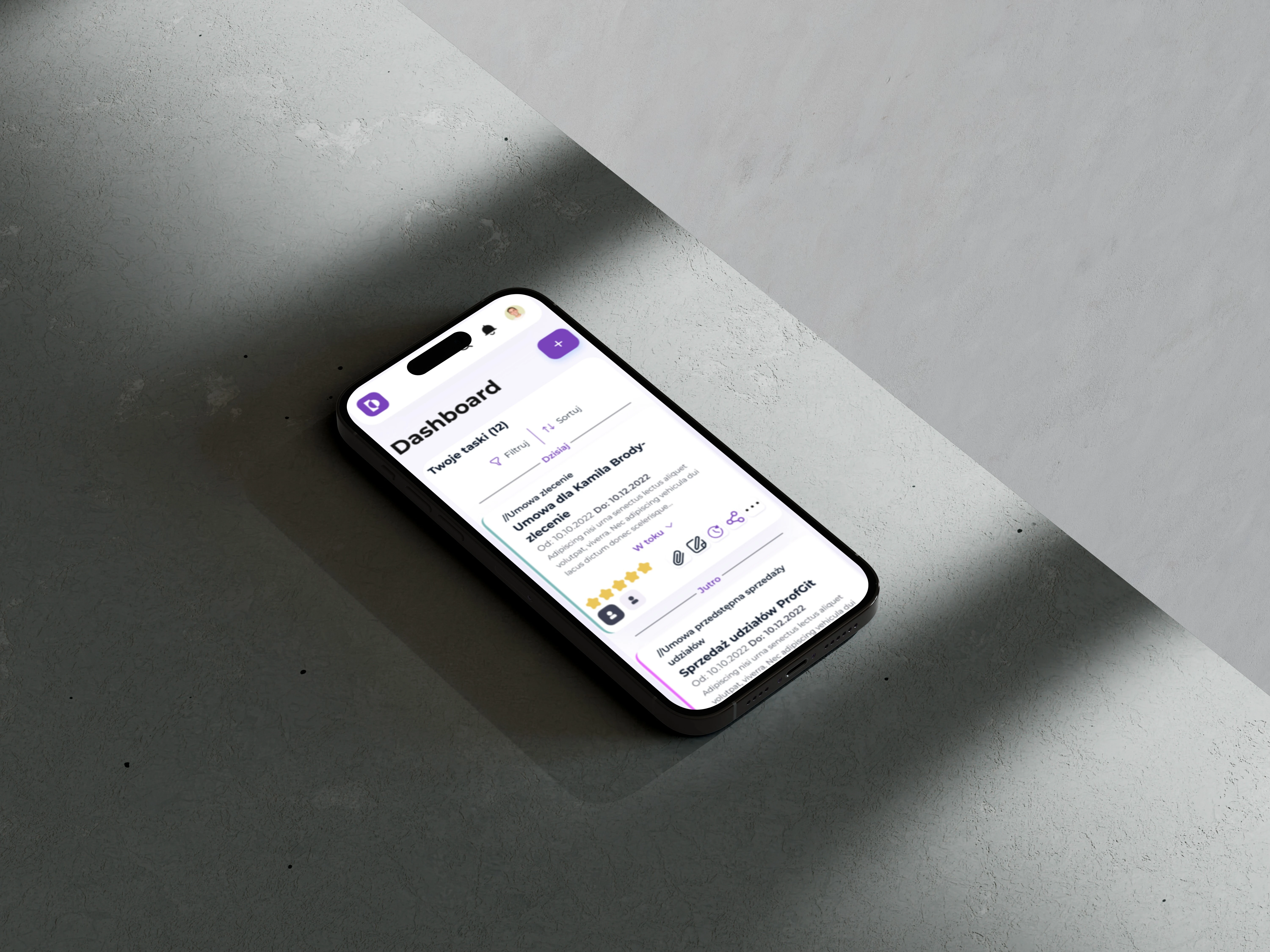
Final Design
The dashboard we created included a comprehensive set of features designed to maximize efficiency and user satisfaction. The dashboard we created included a comprehensive set of features designed to maximize efficiency and user satisfaction.
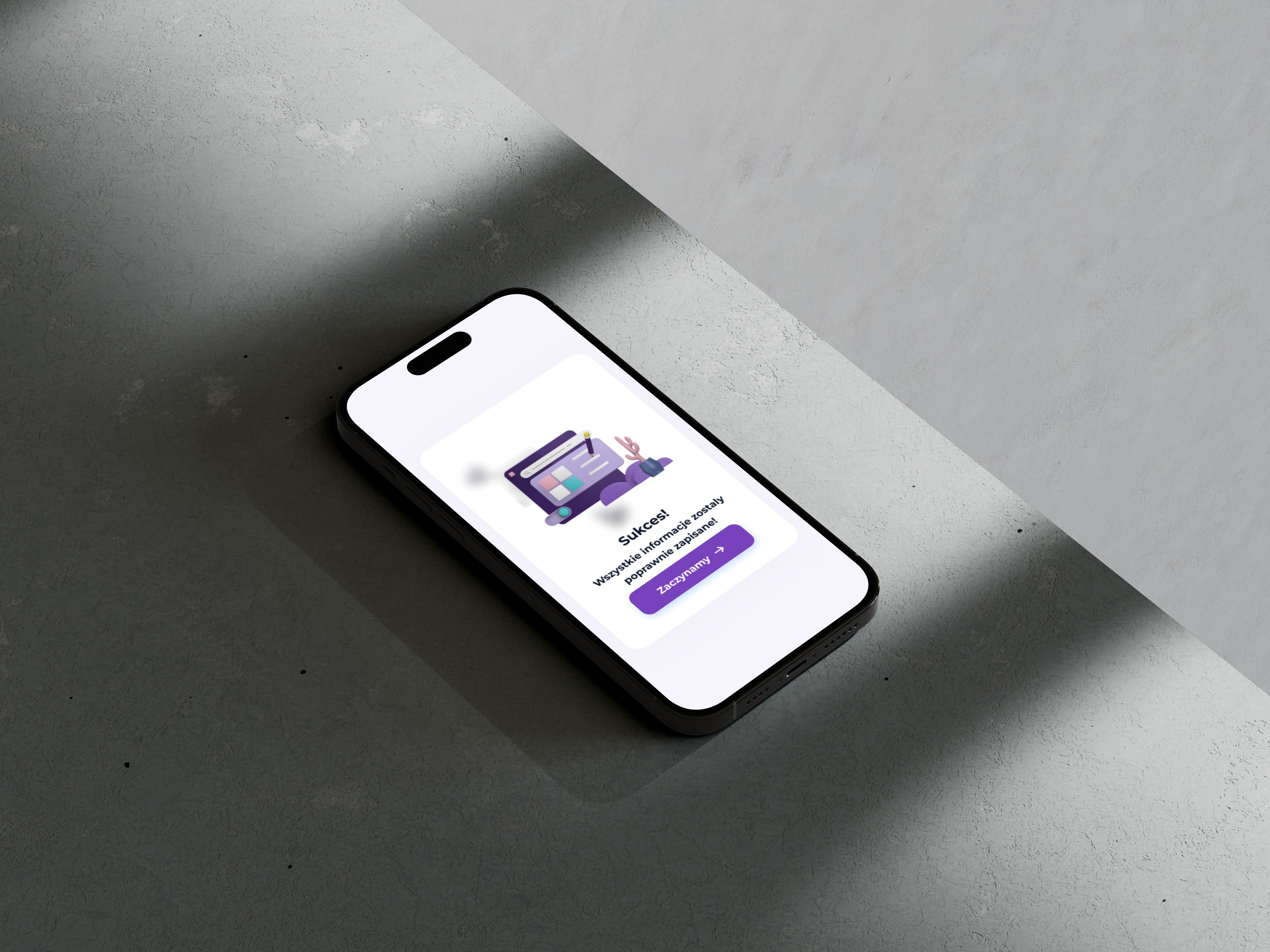
The user-friendly interface offered customizable workspaces, intuitive navigation patterns, clear visual hierarchy, and robust accessibility features. For data insights, we implemented real-time document tracking, progress visualization, performance metrics, and AI-powered suggestions. Efficiency features included one-click document processing, smart templates, automated workflows, and batch processing capabilities. The seamless experience was enhanced by cross-platform compatibility, real-time synchronization, offline capabilities, and quick-action shortcuts. Our technical implementation delivered responsive design across all devices, real-time data visualization, AI-powered document analysis, a custom notification system, role-based access control, and multi-language support. The impact was significant, with a 25-minute average reduction in document processing time, 75% increase in user satisfaction, 90% adoption rate among target users, and 40% reduction in document-related queries.
Product Images

Achievements
Lessons & Growth This project taught me valuable lessons about: • Balancing innovation with familiarity • Designing for different tech comfort levels • The importance of continuous user feedback • How to make complex AI features feel accessible Looking back, what makes this project special isn't just the metrics – it's how we managed to make advanced AI technology feel natural and helpful in a traditionally conservative industry. The positive feedback from users, especially those who were initially skeptical, proved that good design can bridge the gap between cutting-edge technology and practical, everyday use.

