Municipal Waste Sorting App
A waste sorting app that gives instant answers on how to dispose of items correctly while connecting to city schedules for special collection services.
00

problem
Sorting trash in Poland is more complicated than it looks. The rules aren't intuitive. Greasy pizza boxes can't go in the paper bin, they belong in general waste. Compound items like electronics or furniture have special disposal requirements, and the city only collects them on specific schedules that are buried on outdated municipal websites. People wanted to recycle correctly, but figuring out where each item belonged was confusing and time-consuming. The result was contaminated recycling bins and frustration with a system that should have been straightforward.
solution
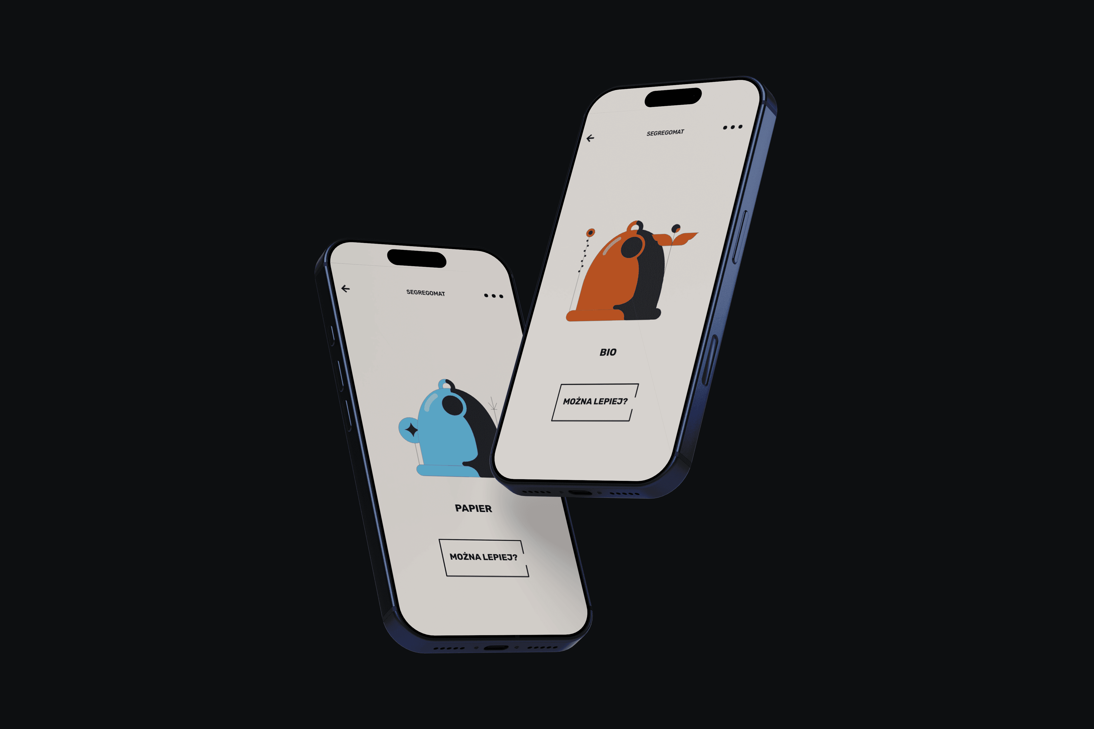
Segregomat is a mobile app that gives instant answers on how to dispose of any item correctly. Users can scan barcodes to get specific guidance, and the app taps into the city's database to show schedules for special collection services like furniture or electronics. Visual cues use bin colors to make sorting intuitive even for children and elderly users. The interface is simple and accessible, cutting through the complexity of municipal waste rules and making it easy for anyone to recycle properly.
I led the project as Concept and Product Lead in 2020, handling brand design, logo creation, motion design, UX/UI, research, accessibility, and localization over six months.
At the time, Poland had no app like this, and I saw an opportunity to solve a problem that affected every resident in the city. Waste sorting rules were confusing, and the infrastructure for special collections was invisible to most people.
Research was essential. I conducted over 50 interviews and observations to understand where people were getting stuck. The patterns were clear: tricky items like greasy packaging created confusion, and exceptions to the general rules weren't well communicated. The biggest recurring issue was special waste collection. People would hold onto old furniture or electronics for months because they didn't know when the city's collection service was coming, and tracking down that information meant navigating terrible municipal websites.
The content structure became the backbone of the app. I organized items by taxonomy, added synonyms to account for how people actually describe things, and built in exception rules for edge cases. Images of bin colors took the lead in the interface, giving users an immediate visual cue before they even read the text. This approach worked for everyone: kids, elderly users, and people who weren't confident in their literacy.
Accessibility testing covered screen readers and color-blind reviews to make sure the app worked for the widest possible audience. The tone needed to be simple and friendly, easy to understand regardless of age or background. I kept the copy short and action-oriented, focusing on what users needed to do rather than explaining the rules at length.
Integration with the city's waste management system was a key feature. By tapping into their schedule database, we could show users exactly when special collections were happening in their neighborhood. This solved the furniture problem that had been plaguing the city for years. People finally had an easy way to plan disposal of large items without guessing or waiting indefinitely.
The app launched successfully, and the response was strong enough that the city of Wrocław purchased the project from me and adopted it as an official municipal tool. Lookup success rates and user ratings were high, and support questions to the city about waste sorting dropped noticeably. The project proved that solving mundane problems with thoughtful design can have real civic impact.
01

02

see also


0D0F11