Corporate Banking Website
A redesigned corporate banking website that unified global information access and empowered non-technical teams to publish content independently.
00

problem
The main bank website served as a gateway to the business, but it was outdated and inaccessible. Luxoft operates differently around the world, retail banking in some countries and B2B only in others, which made it nearly impossible for clients and businesses to find relevant information. The outdated design locked marketing, legal, and information teams into dependency on developers for every update. Without a dedicated dev team for the website, publishing campaigns or updating content took far too long. Teams across multiple regions who lacked technical skills were frustrated trying to manage WordPress on their own, and the process was slowing down the entire organization.
solution
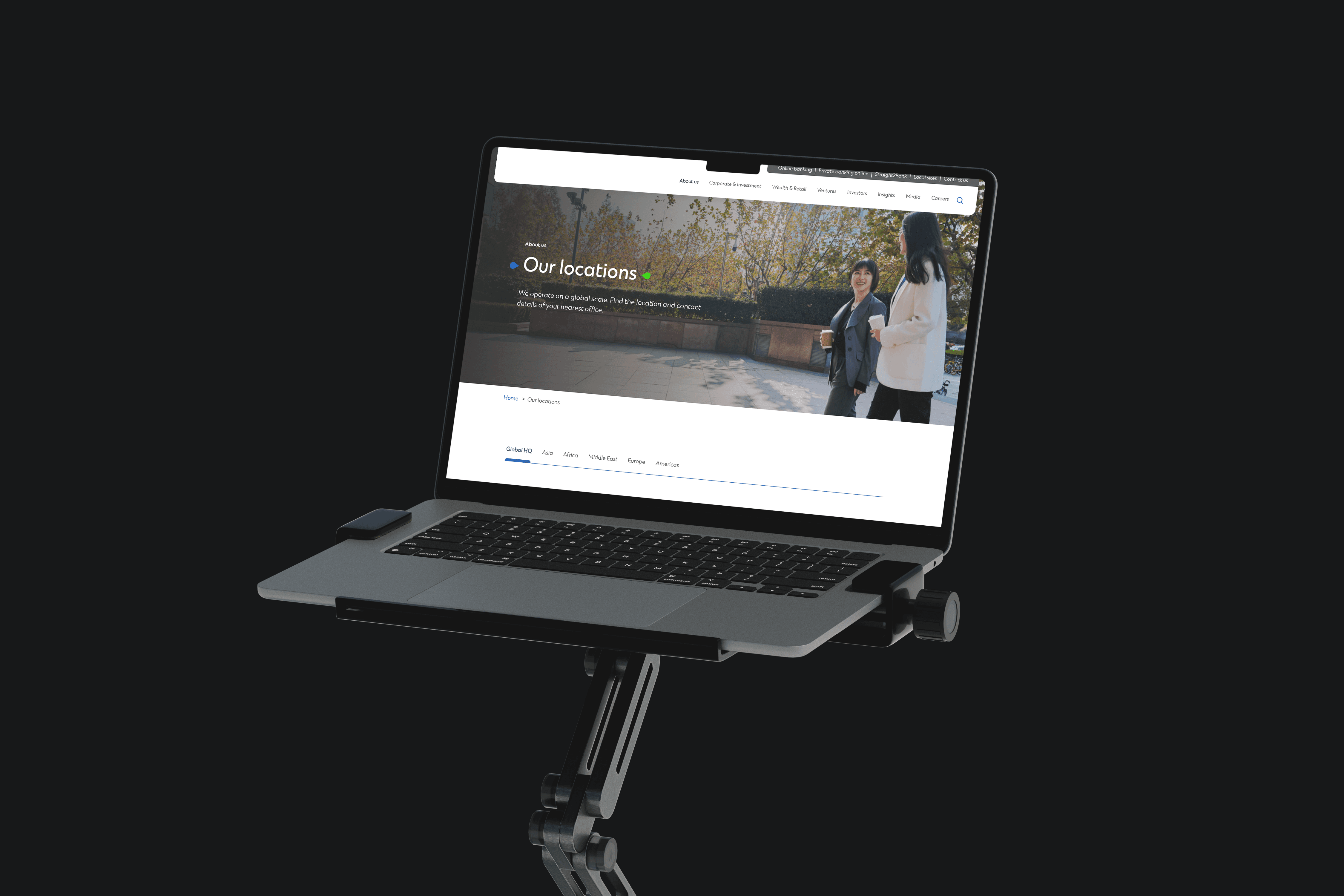
A redesigned WordPress-based website with a flexible design system that empowers non-technical teams to publish content quickly and consistently. By introducing typography layouts, photography guidelines, animation standards, and accessibility compliance, the site became both easier to use and more professional. The restructured CMS made it possible for marketing and legal teams worldwide to manage their own content without waiting on developers, cutting publishing time and reducing UI defects while improving search visibility and user experience.
I joined the project as Product Designer in 2023, knowing from the start that the six-month timeline was driven more by corporate approval cycles than actual design work.
The bank's website was serving a complex global audience, and the existing structure couldn't handle that complexity. Clients struggled to find information relevant to their region. Internal teams across countries were bottlenecked by the need for developer support just to update a page or launch a campaign.
The core challenge was making WordPress work for a modern, multi-regional corporate site. WordPress isn't as flexible as custom coding, so I had to maneuver around its limitations to create layouts that felt polished and professional. I introduced a design system built on typography layouts, photography standards, and animation guidelines that gave teams the tools to create consistent content without needing design oversight for every decision. Accessibility was non-negotiable, so we targeted WCAG compliance and fixed issues around contrast, focus order, and heading structure that had been ignored in the previous version.
Performance and search visibility were major pain points. Users complained that research on the site was difficult, which hurt both customer experience and SEO. I worked to streamline the information architecture and improve page load times, which led to faster loading speeds and better search rankings. Analytics revealed that type weight and spacing adjustments improved readability significantly, so we iterated on those details until the site felt easier to scan and navigate.
One of the most impactful changes was setting up the CMS to keep editors on rails without making them feel restricted. We created templates and contributor guidelines that let marketing and legal teams publish content confidently while maintaining visual consistency. This governance structure reduced the need for constant review cycles and meant teams could move faster without sacrificing quality.
The results were tangible. Publishing time dropped, UI defects decreased, and accessibility scores improved across the board. The site became a tool that teams could actually use rather than a bottleneck they had to work around. The project proved that with the right design system and CMS structure, you can give non-technical teams real autonomy without losing control of quality.
01

02

see also


0D0F11